

My approach
When planning redesigns, I like to gather feedback from both internal stakeholders and end users. Understanding their thoughts, preferences, and pain points is essential for creating successful products.
For prioritization, I use a simple matrix that evaluates ideas across two dimensions: Time to implement and effort required (design, research, and development resources). The best solutions a designer can make are those that don't require a rewrite of the back-end.
My recommendations
Location-based personalization on Home
Current state: The Home page is simple and valuable, while the Locations page provides detailed, location-specific information. Users must navigate between pages to find relevant content for their location.
Recommendation: Allow users to select their location directly from the Home page. Based on this selection, dynamically display relevant information without requiring navigation to a separate page.
Impact: Reduces user effort and friction in finding location-specific information.
Reconsider usage of shadows
Current state: Shadows are used throughout the site as a decorative element.
Recommendation: Align with industry standards (Apple's Human Interface Guidelines and Google's Material Design) by using shadows sparingly and purposefully—primarily to indicate depth for interactive elements like modals, dropdowns, and layered content.
Impact: Creates a cleaner visual hierarchy and improves usability by reserving shadows for functional purposes.
Improve navigation and content discovery (designed solution)
Current state: The app lacks intuitive navigation and doesn't provide easy access to Elevation's full sermon and media library.
Recommendation: Redesign the app's navigation structure and create a dedicated "Watch" page for comprehensive content browsing.
Impact: Makes Steven Furtick's sermons and Elevation's media library easily accessible to users who want to explore content.
Designed solution: App navigation & Watch page
Navigation Improvements
Top navigation
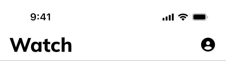
Changes made:
- Simplified to show only the page title and user profile
- Removed the logo, channel slider, and livestream icon
Rationale: Reduces visual clutter, provides clarity, and optimizes screen space.
Tab bar

Changes made:
- Implemented a cleaner Tab Bar component from the Katana library (currently not in production)
- Added two new tabs: Watch and Community
- Replaced "Locations" with "Community"
Rationale:
- "Community" is more inviting and clearly communicates value to users
- "Locations" feels utilitarian and doesn't convey what users will gain from it
- The "Watch" tab provides access to the full media library (a feature currently missing from the app)
The Watch page
Problem solved: Users currently cannot easily access Elevation's complete sermon and media library within the app.
Solution features:
- Hero content: Latest, featured, or live sermon prominently displayed at the top
- Channel filters: Listed below hero content; function as filters rather than page redirects
- Horizontal scrolling sections: Optimizes space and allows for multiple content categories
- Sort and filter options: Helps users quickly find specific sermons or topics
Key benefit: Provides full access to Steven Furtick's sermons and Elevation's media in a low-code, user-friendly interface.